Filtering reports
If you are reading this book, then you already know how reports are built, so how a report can be filtered is not a secret to you. However, I bet there are some configuration options that you are not aware of or that you may have never used before. One of them may be the filter by role hierarchy. As the name suggests, it is possible to filter the results based on the roles of the users who own the records.
To access this option, on the Report Builder, click on Filters | Show Me and select the role you want to narrow:
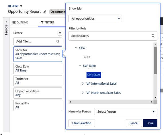
Filtering reports by hierarchy role
Another important option is the cross filter feature. With this feature, you can filter with a condition on a related object.
If we are creating an opportunity report, for example, we can decide whether we wish to host records that have products with a quantity greater than 1.
To achieve this, click on the Filters menu and choose Add Cross Filter. This will set up filters on opportunities with products that have a quantity greater than 1:
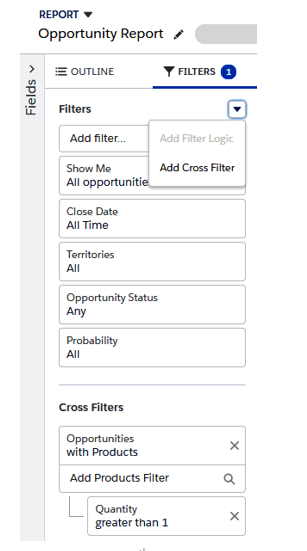
Cross-filter selection
Great power comes with great responsibility, so be cautious when you’re using these kinds of filters as it will slow down your report’s performance.
Moreover, you can only choose the related objects that have been set up on the report type, so choose your report type wisely.
We can use no more than three cross filters per report and five subfilters per cross filter.
Charting report data
To add a chart (you can only have one chart per report), use the Add Chart button (both in Classic and Lightning). Remember that your report must be in summary or matrix format before you can add charts:
Adding a chart
The following are the settings that we can configure:
- Chart type: Decides on the type of display (such as bar, line, pie, funnel, scatter, and so on), which may depend on the report format.
- X-Axis/Y-Axis: Decides on which metrics to show in each axis by the record count, groupings, or summary fields.
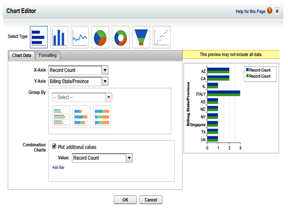
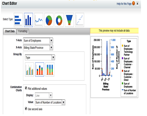
- Combination Charts: We can plot additional values on the chart if the chart supports this feature (for example, we can add the number of employees of a given account, along with the number of locations where the account makes sales). When displaying values with different scales, you can add another y axis to the chart so that values are displayed accordingly and in a readable way:
Combination example
- Grouping: If we have more than one grouping (for example, accounts by country and then by type), we can chart how each grouping contributes to the overall count:
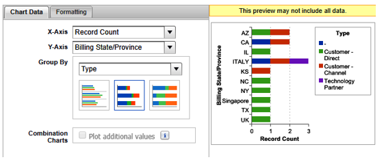
Grouping example on charts
- Values/wedges/segments: Which values and wedges are displayed depends on the kind of chart you use (pie, donut, or funnel chart).
We can format the chart with various settings, all of which you can find on the Salesforce Help page at https://help.salesforce.com/articleView?id=reports_chart_formatting.htm&type=5.
There are some considerations that we need to be aware of when adding a chart to a report (as of Summer 2019):
- We can have up to 250 groups or 4,000 values in a chart. If we go over these limits, you will receive an error when running the report.
- If a running user loses access to a given field being used in a chart, another field of the same report may be used; otherwise, the record count is used.
- Numeric and currency fields should be rounded up to two decimal places, while percentages should be rounded to one decimal place.
- Negative values are displayed in bar and line charts but not in funnel/pie/donut charts.