Setting up a dashboard
Dashboards can be created in Lightning Experience and Salesforce Classic, but in this chapter we’ll be digging into Lightning Experience.
For all the details on how to deal with Classic Dashboards, refer to the Salesforce Help at https://help.salesforce.com/articleView?id=dashboards_create.htm&type=5.
Before creating a dashboard, make sure you have at least one source report (refer to the previous chapter for more information on them).
Navigate to App Launcher | Dashboards and click on the New Dashboard button. If you’re using a brand-new Developer Edition org, you won’t see any dashboards.
Next, add the name and description of your new report (as shown in the following screenshot), but and leave the Folder field as the default (or choose your own folder):
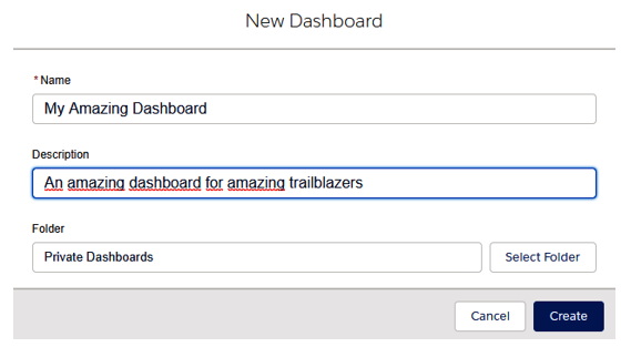
New Dashboard page
Once you have selected a name and a folder for your new dashboard, jump to the dashboard edit panel. If you are used to Classic Dashboards, you will be a bit surprised by the dashboard editor’s layout:
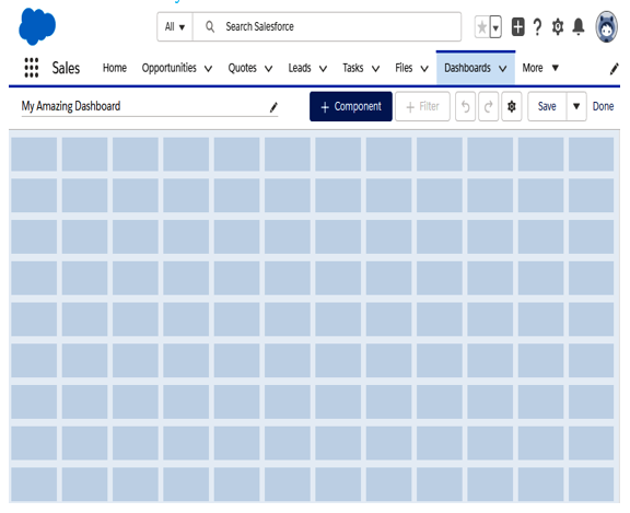
Dashboard editor
You can add up to 12 components per row, but I strongly suggest that you don’t do this, as the dashboard will become completely unreadable.
To proceed with adding components, go through the following steps:
- Click + Component to add a new component to the dashboard, and in the upcoming modal, choose a source report (a component is just the way we identify a report charted within the dashboard. More than one component can refer to the same source report):
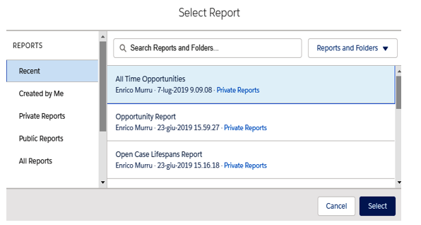
Source report selection
In this example, the All Time Opportunities reports show opportunities records grouped by account.
2. Click Select and then choose the component properties (i.e. charting options):
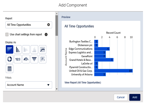
Configuring a dashboard component’s chart
3. Click Add, and the chart will appear on your dashboard:
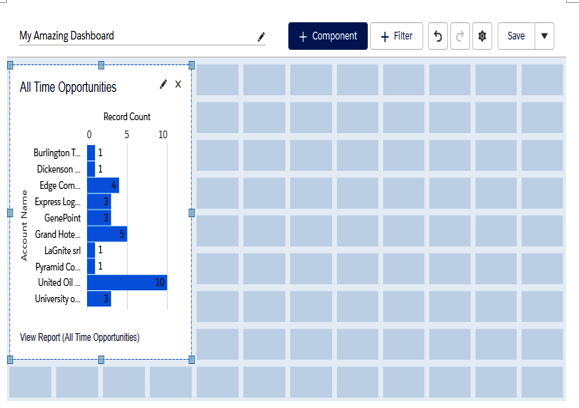
Component added in the dashboard editor
The component can now be resized to fit your needs.
4. Now click on the gear icon next to the Save button to configure more settings:
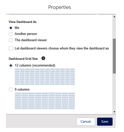
Further settings for the current dashboard
Other than the report name, description, and folder (not shown in the previous screenshot), we can select the running user of the dashboards, which means that data will be shown according to the selected user’s level of access.
We can choose the following values:
- Me: The dashboard is always run with your user’s level of access (anyone will actually see the dashboard as you do).
- Another Person: Choose any other user (the default is your current user).
- The dashboard viewer: This is called a dynamic report, which has a few limitations. We can have up to 5 dynamic dashboards for Enterprise Edition, 10 for Unlimited/Performance Edition, and 3 for Developer Edition, and other editions don’t support this feature.
The Let dashboard viewers choose whom they view the dashboard as flag lets users manually select another user to view the dashboard as: you can let users view dashboards as any other user. If they have the View My Team’s Dashboards permission in their profile, then they can select any user below their role hierarchy; if they have the View All Data permission, then they could select any other user in the org.
Other options refer to the number of columns in the dashboard grid (12 or 9), and if you scroll down the Properties modal, you’ll also get a dashboard theme and palette customization.
Add some other components, then click the Save button and then click Done to have a look at your new dashboard:
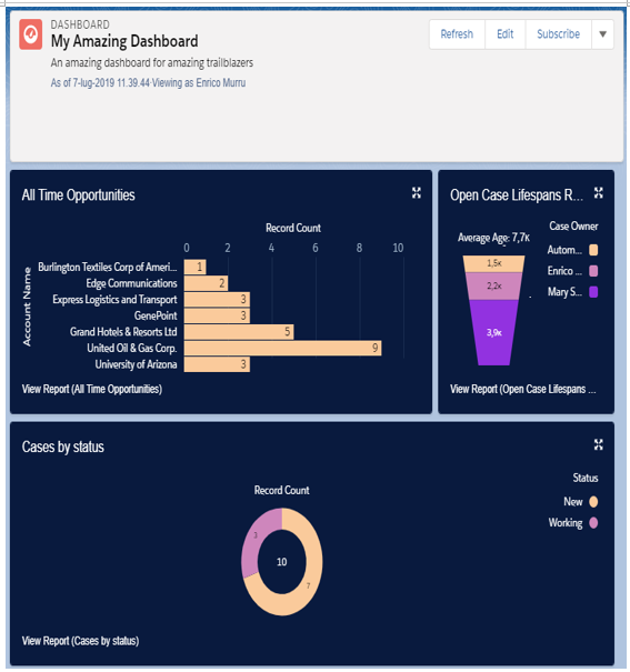
New dashboard
Let’s look in more details at component customization and charting.
